MIKE BRODIE

From Mike Brodie’s book A Period of Juvenile Prosperity
Afterimage by Scott Hobbes Bourne:
A foreboding, the crossroads of youth, a fork in the void. A young mother with legs spread wide only moments away from forcing a child into the world. To focus on the center of this image and let your imagination run out, is to see the unopened door to the womb. A tender, sparse pubis ripe for the picking. A family tree putting on another ring, each and every one of her roots a dead-end road. The unknown abyss staring back at an unassuming youth, believing all the while there were dreams out there.
The photographer finds himself at a particular latitude and longitude where rules and logic no longer apply and harsh reality sets in. The scene before him is one that cannot be created, it must be recognized and then captured in order for its power to become a reality. Nailed to the pages of Mike Brodie’s book: A Period of Juvenile Prosperity, this image takes on an importance which is historic. All this space, and no-where to go. How many lost youths have traveled these tracks, or crossed this overpass and failed to recognize that jagged horizon fading into a soft white, each and every one of us on a collision course with death. No matter which way you take, you’ll arrive at the same place. A hypnotic, heavenly light at the end of a long tunnel, always and forever, just out of reach. The vast American nightmare and nowhere to sleep! Looking at this photograph I feel my entire youth summed up in one seductive and chilling image that cannot be altered by time. The roads are impassable, and no matter how many have traveled them, they’ve left no tracks, there is no map, and they never, ever, came back. You are alone, and this photograph lets you know it. You can either embrace that, or hurl yourself off the bridge onto the tracks. This is quite possibly one of the most incredible landscapes ever collected by an American photographer because it shows us that.
If a book has a binding that holds it together, it’s this single photo that holds all the other images in place, gives them potency, and allows them to make their mark. You cannot get here without being stranded. This is what it means to be young and without a country no matter what has been preached in the schools and churches that dot the landscape like a false constellation, you are looking at god and getting no direction. Not a star in the sky you can trust, not a compass to make sense of the landscapes, you are on your own out here. Mike Brodie has been there, done that, and miraculously made it from this impasse without landing on the tracks or the bill of a speeding train. He has found that place where one shot on fallen snow is more powerful than all the guns in the world. This is what it means to photograph.
TORIL JOHANNESSEN

Photo from Arne Nævra.
Afterimage by Toril Johannessen: It’s a tough question. I automatically start thinking about all the photographs that has stayed with me from when I was studying photography. I looked at images in a different way then, often in books, and would get back to the same images again and again.
But if I have to choose one image, and one that has been with me for a while, it’s the image of the polar bear on the remnant of an iceberg in Svalbard by Arne Nævra from 2005. It’s been widely debated and shown in different contexts, which is one of the things that make the image interesting to me. The photograph was criticized by the so-called Klimarealistene for being manipulated, to support their claims that climate change is not caused by human factors – as if a faked photo would prove that anthropogenic climate change is a hoax. In any case, the picture isn’t manipulated, but the false claim about fakery perhaps says something about our relationship with the truth of photographs.
I found the photograph recently again on a postcard in Tromsø with the text ‘Norway’ written on it. There, amidst picturesque motifs of the Northern Lights, mountains and fjords, the picture was used as a sort of advertisement for Norway and spectacular nature. It’s completely absurd. It’s such a symbolic image, but as a postcard it makes me think of Norway as an oil nation, a force that contribute to climate change. Turning the image into an “advertisement”, the postcard comes across as an emblem of Norwegian double standards.
The motivation of the photographer is clear: he’s a nature conservationist, but the image takes new directions outside his control, which makes it even more fascinating.
PETER HUJAR

Peter Hujar, Candy Darling on Her Deathbed, 1973.© 1987 The Peter Hujar Archive LLC. Courtesy Pace/MacGill Gallery, New York and Fraenkel Gallery, San Francisco.
Afterimage by Preben Holst:
I was intrigued by the picture before I knew about Peter Hujar and his work. It really hit me when I saw it years ago, and it remains on my mind today. Knowing Candy Darling’s story makes the portrait even stronger. Hujar’s photograph says a lot about her, about him as photographer, and also about the time they lived in. They were part of a creative group of people around Andy Warhol’s Factory in a time when everyone broke old conventions and created their own rules with an attitude that doesn’t really exist anymore. You won’t find these kind of people today, when everything, from buildings to personalities, are gentrified.
I can see that he has portrayed her in a very respectful fashion. He is in no way intrusive; there exists a mutual respect between them. She had actually asked him to portray her, and to me the title “turns the volume up” for the photograph. She was only twenty-nine at the time. She was a transgender woman dying of lymphatic cancer, probably caused by her hormonal treatment.
She had grown up knowing she was different. Her dream was to become a very famous blonde actress. Kim Novak was the goal. When she moved to Manhattan, it didn’t take her long to join the underground art scene. Warhol said she should be in the movies, and she appeared in several of his films, though she never got the big commercial break she dreamed about. (She did, however, featured in a play by Tennessee Williams.) At some point Warhol tired of her, as he did with many people, and she struggled after that. You can see so much of this history in Hujar’s picture—the Factory, the broader cultural environment, and the physical and emotional changes she underwent.
The portrait is personal and dignified. Later, Hujar said that in the image Darling had played all the great death scenes featuring women, that it was her final performance. She knew it was the end of her life. She was extremely tired and sick when the portrait was taken, but fought to rise to this last role.
Antony and the Johnsons later used Hujar’s picture on the cover of the 2005 album I Am a Bird Now, extending the portrait’s reach into the wider culture. Their music and Darling’s history are both about outsiders and exclusion, about all the things Darling lived through.
A grace note: Lou Reed wrote about Candy Darling in his songs and he also invited Antony and the Johnsons to be his warm-up band. A lovely coincidence.
DAVID GOLDBLATT
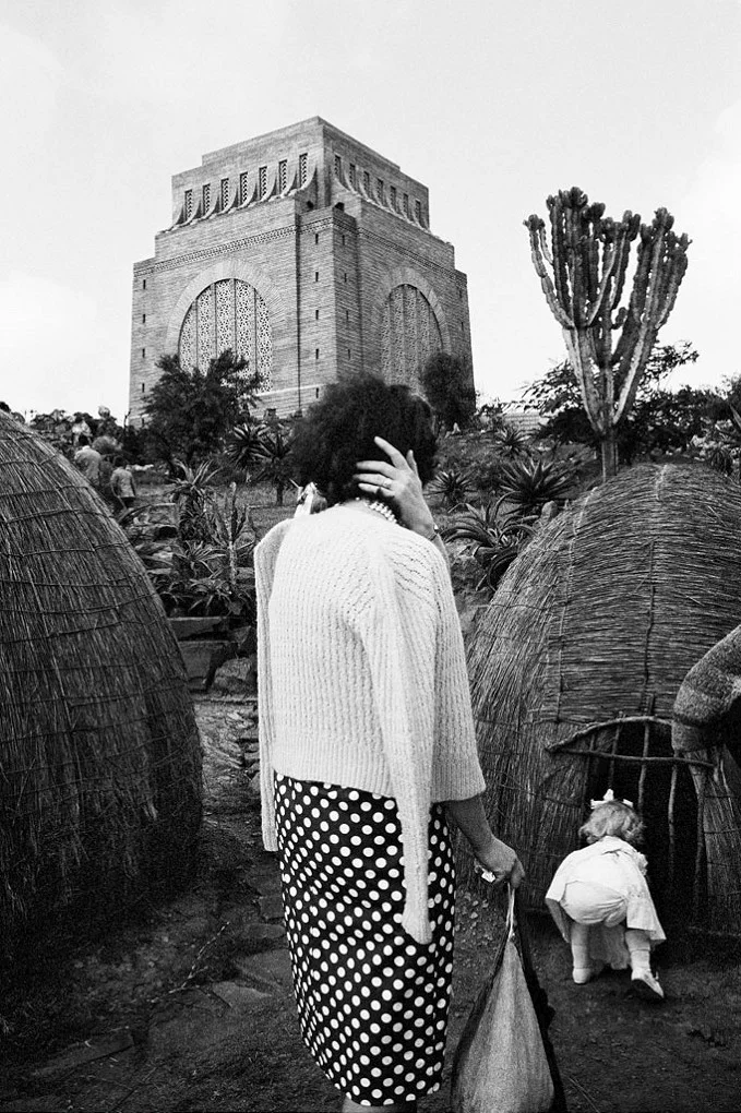
David Goldblatt, Child with a replica of a Zulu hut at the Voortrekker Monument, on the Day of the Covenant, Pretoria (3_9248), Dec 1963, Courtesy Goodman Gallery.
Afterimage by Kobie Nel:
Keep looking… polka dots and pearls
A woman with three arms? She is dressed fashionably and precise.
Her daughter, who is just as fashionable, is about to enter the darkness of a straw hut.
I sense that ribbon in her hair won’t be in place much longer.
Then there is this brutalist monstrosity in the background overlooking it all.
Is she staring at the monstrosity, calling her daughter back to safety, or conscious of her appearance in the presence of a photographer?
The child has turned her back on her mother, the mother has turned her back on the photographer and the photographer’s back is turned on me, the beholder.
We are all faceless.
I have an urge to keep looking. What is unfolding in front of me?
The viewpoint is slightly elevated and settles my gaze on the tower overlooking it all.
Is it a tower? With a sudden ‘eureka' moment of discovery, I do know what is going on here.
As a child, I visited this place many times with my parents during summer vacation road trips. It is a familiar landmark in South Africa: The Voortrekker Monument, its shape deeply rooted in my heritage. The monument is the symbol of the struggle of the Voortrekkers, my ancestors, who left the Cape Colony on The Great Trek. The Great Trek was a migration of Dutch-speaking settlers who travelled by wagon trains from the Cape Colony into the interior of modern South Africa, seeking to live beyond the Cape’s British colonial administration. The idea was to build a monument in honour of God. Today, you can find its image on many old cookie tins in secondhand markets, or on display in your grandmother’s kitchen ‘top shelf’ cookie tin collection. Often, they’re next to the British royal wedding tins, which contradicts the whole Afrikaner/British relationship. But that’s another story.
This photograph was taken by South African photographer, David Goldblatt, who passed away last year. I am very familiar with his work, but this photograph was unknown to me until I first encountered it, to my surprise, in an email. I met Goldblatt when I was 19, eager and ambitious to pursue documentary photography as my career and curious about this man photographing Afrikaners, who refused to let the work be used in a journalistic context. Goldblatt documented the tumultuous period in South African history that was still going on until just weeks before his death. But he also photographed white South Africa, taking the same dispassionate look at white nationalists, the comfortably wealthy, and the poor and disenfranchised he found among them.
Before he died, Goldblatt bequeathed his archive of negatives to Yale University. It was a controversial move; he had previously promised the trove to the University of Cape Town, but withdrew his collection after student protestors began burning campus artworks that they deemed to be ‘colonial symbols’.
I have not lived in South Africa for ten years and the thought of his work – including this photograph – being destroyed terrifies me. What the image shows is a nuance. It does not show the horrors of that period, but a woman who could have easily been my grandmother with my mother, both of whom possibly did attend this memorial event that took place once a year. The day commemorated the vow taken by the Voortrekkers before the Battle of Blood River, that if God gave them victory over the Zulus, they would always keep this as a day of thanksgiving. The Afrikaner dress code for these events was strictly formal; for women, pantyhose was a must.
The monochrome tones of the image create immense depth and compassion, so much so that I want to reach in and touch the woman’s shoulder, feeling the texture of her jumper.
In itself, the image is ordinary – a bit strange at first glance. Like many of Goldblatt’s photographs, it isn’t dramatic, the subjects unknown. Perhaps the little girl in the image is someone else’s daughter, just a little girl trying to peek inside the straw huts on display. But it shows the casual exterior of a society separated by apartheid, while at the same time capturing the uneasiness that pulsed through my childhood when growing up in South Africa, as well as through my parents' childhood. It recalls things I saw but did not see. And it drags up the old questions that lurk beneath my memories – how could such ordinariness take place while countless horrors were happening off camera?
Today, I am grateful to Goldblatt for this image, which helps me understand my own heritage, as well as what one chooses in order to represent our time. As Susan Sontag wrote in her essay ‘On Photography’, ‘The ultimate wisdom of the photographic image is to say: “There is the surface. Now think – or rather feel, intuit – what is beyond it, what the reality must be like if it looks this way.”
MAYA ØKLAND

Afterimage by Maya Økland:
In her eyes I see the foremothers that preceded us. Her weathered face is framed by raven black hair. Her back is straight. She has an expression of seriousness and strength. Is that a fly on her collar? Her eyes pierce through the camera, as if she sees through time, knowing everything about us. Yet we know nothing of her, except for the measurements that the men from the State Institute for Racial Biology took of her physical features. Her name isn’t stated in the photograph, nor the exact place in which she was photographed. It is simply noted that it was either in the town of Dorotea or Vilhemina in Northern Sweden. The image was taken in the name of science as one of the means to claim authority over her indigenous life and land. A shame builds up in me when I think about those men who made these documents with such ignorance. Sweden has still not ratified the ILO 169 – Indigenous and Tribal Peoples Convention – an international treaty for the rights of indigenous people.
But still, I find this image precious. The reason for its existence is slowly being defeated by time. Photography does not live to serve its creator. It has a life of its own, for better or worse. It remains the same through time, whereas human ideas of racism are subject to change. It was wrong to take the photograph, and the Swedish State should apologise with more than just words. However, the photograph itself has already moved on.
In the late 1980s, the Sami artist Nils-Aslak Valkeapää (1943–2001) started to collect historical scientific images of his people. For six years he financed his travels to archives in Paris, Seattle, Helsinki and Kirkenes by combining them with concerts and poetry readings. He found almost 400 images and they were compiled into the book Beaivi, Áhčážan (The Sun, My Father) together with illustrations and poems that he composed in the Sami language. It was from the pages of this book that the woman with raven-black hair spoke to me. Not as an anthropological object or ethnographic study, but as a foremother of a culture that must not be forgotten, and whose future should be imagined with urgency.
HAGEN HOPKINS

Hagen Hopkins. GETTY IMAGES.
Afterimage by Kate Warren: I was excited to participate in Objektiv’s “One Image” column, but trying to pick a single photograph to write about was more difficult than I had imagined! With so much conflict and uncertainty confronting our societies and communities today, choosing one image to represent everything that is currently on my mind felt like a slightly overwhelming task.
In the end I settled on this photograph, taken on Friday 15 March 2019 at a Climate Strike rally in Wellington, New Zealand. The photograph’s frame is filled with a large group of young people, many holding signs and placards with their mouths open, fists raised, and hands poised mid-clap. Most of their gazes shoot off in different directions, towards each other or attracted by action happening outside the frame. In the middle though, one of the young girls appears to be looking directly at the camera, as she raises her cardboard sign above her head. Whether or not she was actually addressing the photographer directly hardly seems to matter; the centrality of her gaze and her message creates a moment of individual interaction amongst the large crowd.
The slogan drawn on the girl’s sign, “There is no planet B!”, also caught my attention. Across these young people’s protests – which have been inspired by Swedish student Greta Thunberg – the intelligence, emotion and humour of their slogans, speeches and calls to action have been impressive and inspiring. They are reminders of the political and visual literacy that young people possess today (even if some of our politicians would seek to deny and refute the political agency and engagement of younger generations). Yet amongst all the diverse and creative messages held high on these young protesters’ signs, some slogans proved particularly popular and recurrent. “There is no planet B!” is one such example. I spotted it on signs from Hong Kong to Gibraltar, South Africa to France, Australia to Germany, and more.
This slogan is effective for a number of reasons. By evoking a scenario of pure science fiction – for example, think of the “Off-World Colonies” in Blade Runner – the slogan in fact reasserts the reality of our present. It conveys a visually evocative sense of urgency. My mind goes, unsurprisingly, to the famous “Blue Marble” image taken by NASA astronauts of the Apollo 17 mission. Of course, it is quite likely that somewhere in the universe, there could be planets similar to Earth that are sustaining sentient life. However, the reality of climate change means that for human and non-human animals on Earth, there really is no Planet B to escape to.
Photographs of children and young people are inherently symbols of the future, of lives not yet lived and potential not yet filled. Yet this slogan, and indeed the multitude of images of Climate Strike protests, evoke an impossible future. They speak to the uncertainty and anxiety that is palpably affecting these young people. As Australian academic Blanche Verlie has written recently, climate change is fundamentally changing “young people’s sense of self, identity, and existence”. They are the first generation to have only known a world under catastrophic threat of climate change. These protests and images are about recasting dominant symbols and narratives of the future; hopefully, their urgency will transform older generations’ perspectives and actions towards the future as well.
BJØRN OLAV BERGE

Photographs by Bjørn Olav Berge.
Afterimage by Arild Våge Berge:
These photographs were taken by my father when he was 13 years old, during the live broadcast of the Apollo 11 Moon landing on 20 July 1969. He shot the images that were on the TV screen, developed them himself in a darkroom and mounted them on a piece of cardboard.
I can remember these pictures hanging on the wall in his room in my grandparent’s house. When my grandparents died, my father inherited their house. The photographs disappeared for a while, but I recently found them lying on the floor in a dark corner of the cellar.
I’ve never asked my father why he took these photographs, but what I see in them is an eagerness to hang on to what must have been a fantastic moment. There’s something beautiful in the belief that it would be possible to preserve the aura of this transmission of an event that was taking place on another planet by photographing it.
Before the signal finally hit screens in numerous countries on Earth, watched by around 600 million people, there was a time delay when all that was visible was the frame-rate number and band-width conversions. What is actually seen in my father’s photographs is the noise and disturbance from these electrical conversions, radiation and signal enhancement; not to mention the paper discoloration, scratches, dust, dents and stains from the decomposition of the print materials. Yet in this accumulation of noise and distortion I find myself staring directly into my father’s moment of wonder. To me, it looks as if he was there, when humans were stumbling around on the surface of the Moon like children, in a triumphant achievement of modern technology. It is because of the disturbances of mediation and the decay of the prints that I accept this truth of the document. And although great efforts were put into the precision of broadcasting the event and the photographic documentation made by my father, it is in the failure of this precision that I find authenticity.
After the images’ proud days on the wall of my father’s room, they lapsed into waste on the cellar floor, but on rediscovering these old artefacts, discarded and forgotten, I decided to take them with me. By doing this, I’ve become the protector of the gaze of my father as a child, and maybe also the gaze of the world in a brief moment when human technological achievement seemed boundless.
LEWIS BALTZ

Lewis Baltz, Cray, supercomputer, CERN, Geneva.
Afterimage by Rémi Coignet:
I was invited by Objektiv to choose and present one photography. The one I landed on is Cray, supercomputer, CERN, Geneva by Lewis Baltz. The work is drawn from the series Sites of Technology. It is perhaps not the most representative work of the rather dark spirit of the series, and I could have chosen a dozen others ones, even the whole book, but I play by the rules.
Cray, supercomputer, CERN, Geneva expresses the naive optimism inspired by the pop culture that surrounded the first, pioneer years of the computing network. It also translates the realism of the period, linked to Lewis Baltz's unstoppable humor facing the real world moving towards virtualization. So what do we see? In the center of the composition we identify something resembling yellow and blue sculptures, and at their right several monitors seemingly there to pilot the technological looking sculptures.
It was between 1989 – 1991 that Lewis Baltz conceived the series Sites of Technology. The work is his very first one executed fully in colors, and it is also his last book consisting solely of photographies. It was published tardily by Steidl in 2007, under the name 89/91 Sites of Technology.
Since then, Baltz focused on installation works such as Ronde de nuit as well as other various public projects or site-specific works. (1)
When I asked him about this radical choice, to renounce on the book as a "pure" expression of photography, he answered me: "After 1990, no one had time for documentary images, least of all me". (2)
The color first appears in Baltz's work through Candlestick Point (1989), a work standing out from a selection of mainly black and white images. The colors are neutral, cold scaled, unadorned. Once again, when I asked about this sudden introduction of color, he gave me the following reply inspired by Stanley Cavell: "Black and white imagery suggests the past [...]. Color suggests a future that has already begun". If we accept this way of reasoning, we can probably explain the vibrant colors of Sites of Technology as a premonition of our contemporary 2019. This underlines the visionary character of Baltz's work: "It interested me to photograph something that was impossible to photograph.[…]. Because in fact you couldn't see what was really important".
In 1991, the Internet only regarded engineers, computer professionals, and programmers. The Web was only emerging. Sites of Technology was mostly photographed in France and Japan, depicting primarily what was a the time called "supercomputers". They were used by scientific research centers as well as mail-order companies (using catalog paper). This was long before Amazon entered the stage.
More than one billion two hundred million photographs were taken in 2018, mainly with smartphones. Most of them still sleep in the flash memories of our phones, on the hard drives of our computers or on server farms spread out over the four corners of the earth, and they will never be edited. Never have the number of published photography books been higher. At every moment, we are swimming in an ocean of photographies serving the sake of publicity, propaganda or plain narcissism. Paraphrasing Daniel Arasse: we cannot see anything anymore. And it is indeed this future extinction of the image, omnipresent and at the same time a digital ghost, that Lewis Baltz ingeniously predicted with Sites of Technology.
We now know that Lewis Baltz never ceased to photograph, principally in the Italian region Mestre. This can be further discovered in a book that will be published in a few months, following Baltz’s will, five years after his passing.
The quotes from Lewis Baltz are drawn from the interview he granted me for my book Conversations, The Eyes Publishing, 2014.
En Français :
À la demande de Objektiv j’ai été invité à choisir une photographie. J’ai opté pour Cray, supercomputer, CERN, Geneva de Lewis Baltz Cette photo est extraite de Sites of Technology. Elle n’est peut-être pas la plus représentative de l’esprit assez sombre du livre et j’aurais pu en choisir une dizaine d’autres ou même le livre entier. Mais tel était le jeu.
Cray, supercomputer, CERN, Geneva traduit à la fois l’optimisme, un peu béat encore, inspiré de pop culture de ces années pionnières des réseaux et en même temps le réalisme lié à l’humour imparable de Lewis Baltz face au monde réel ou en voie de virtualisation. Qu’y voit-on ? Au centre ce qui ressemble à des sculptures jaunes et bleues et à droite des moniteurs que l’on suppose devoir piloter ces « œuvres » technologiques.
Entre 1989 et 1991 Lewis Baltz réalisait donc sa série Sites of technology. Il s’agit de son premier travail entièrement conçu en couleur. Cela sera également son dernier livre strictement photographique.
Il ne sera publié que tardivement en 2007 par Steidl, sous le titre 89/91 Sites of Technology.
Dès lors, il allait se consacrer à des installations comme Ronde de Nuit (1992) ou à des publics projects ou des site-specifics works. (1)
Lorsque je lui posais la question de ce choix radical, de renoncer au livre comme expression de la photographie « pure » il me répondit : After 1990, no one had time for documentary images, least of all me. (2)
La couleur apparaît dans l’œuvre de Baltz dans Candelstick Point (1989) mêlée à une majorité d’images noir et blanc. Les couleurs y sont neutres froides, factuelles. Encore une fois, lorsque je l’interrogeais sur cette introduction de la couleur, il me fit cette réponse inspirée de Stanley Cavell : Black and white imagery suggests the past [...]. Color suggest a future that has already begun. Si l’on suit ce raisonnement, on peut sans doute induire que les couleurs vibrantes de Sites of Technology suggèrent notre présent de 2019 (donc un futur alors pressenti) et rend visionnaire le travail de Baltz : It interested me to photograph something that was impossible to photograph.[…]. Because in fact you couldn’t see what was really important. En 1991 Internet n’était alors encore qu’affaire d’ingénieurs, d’informaticiens et de programmeurs. Le Web était naissant.
Sites of Technology a été principalement photographié en France et au Japon, représentant pour une large part ce que l’on appelait alors des « supercalculateurs », utilisés aussi bien par des centres de recherche scientifique que par des entreprises de vente par correspondance (sur catalogue papier). Bien avant la naissance d’Amazon.
Plus d’un milliard deux cents millions de photographies ont été prises en 2018, principalement avec des smartphones. La plupart dorment dans les mémoires flash de nos téléphones, sur les disques durs de nos ordinateurs ou dans des fermes de serveurs disséminés aux quatre coins de la planète, et ne seront jamais éditées. Jamais autant de livres de photographie n’ont été publiés.
Nous nageons à chaque instant dans un océan de photographies publicitaires, propagandistes ou narcissiques mais pour paraphraser Daniel Arasse, on n’y voit plus rien. Et c’est cette disparition à venir de l’image, à la fois omniprésente et en même temps devenue pur fantôme numérique que Lewis Baltz a génialement pressentie avec Sites of Technology.
L’on sait désormais que Lewis Baltz n’a jamais cessé de photographier, principalement dans la région de Mestre, ainsi que l’on pourra le découvrir dans un livre à paraître dans quelques mois, suivant sa volonté, cinq ans après son décès.
Les citations de Lewis Baltz sont extraites de l’entretien qu’il m’a accordé pour mon livre Conversations, The Eyes Publishing, 2014.
Rémi Coignet lived and worked in Paris as an editor and writer. This text is translated by Ingrid Holden.
ISA GENZKEN

A spread from Isa Genzken’s Mach Dich Hubsch!
Afterimage by Jenny Kinge:
It was with great anticipation that I walked up the stairs of the Martin-Gropius-Bau, the solemn building on the former border between East and West Berlin that hosted Isa Genzken’s exhibition Make Yourself Pretty! As I wandered through the comprehensive collection of the German artist’s sculptures and installations, with their wide-reaching cultural references, I was taken by surprise by a re-encounter with a long-forgotten idol of mine.
The photo of Leonardo DiCaprio, with his slick hairstyle and cute smile, bound up with sticky tape and juxtaposed with bold colours and elements containing the word DUDE, was part of a rich collage unfolding over the many pages of Genzken’s diaristic book Mach Dich Hubsch!
My crush on Leo had manifested itself through the posters, diaries and magazines I bought in the late 1990s, all furnished with his smiling face. My re-encounter with the young movie star stirred up many memories. When facing the image through the glass vitrine, I felt as if I’d been caught red-handed: the work reminded me how I had wholeheartedly worshipped this dandy as a young girl. I didn’t reflect upon the consumerist aspect of this ‘love affair’ at the time. The material culture crept up from behind, as it still does – my identity is unintentionally affected by my acquisition of things.
I left Martin-Gropius-Bau with a new crush that day – not on Leo, but on the eye-opening work I’d just seen.
FRIDA ORUPABO
Afterimage by Ruby Paloma:
I first saw Frida Orupabo’s work last year in Arthur Jafa’s exhibition A Series of Utterly Improbable, Yet Extraordinary Renditions at the Julia Stoschek Collection in Berlin. I have carried Frida’s Untitled (2018) with me since. I have been searching for a means to contribute to the nearly invisible topic of race in the visual art discourse in Norway and Frida’s work struck me at the exact right moment.
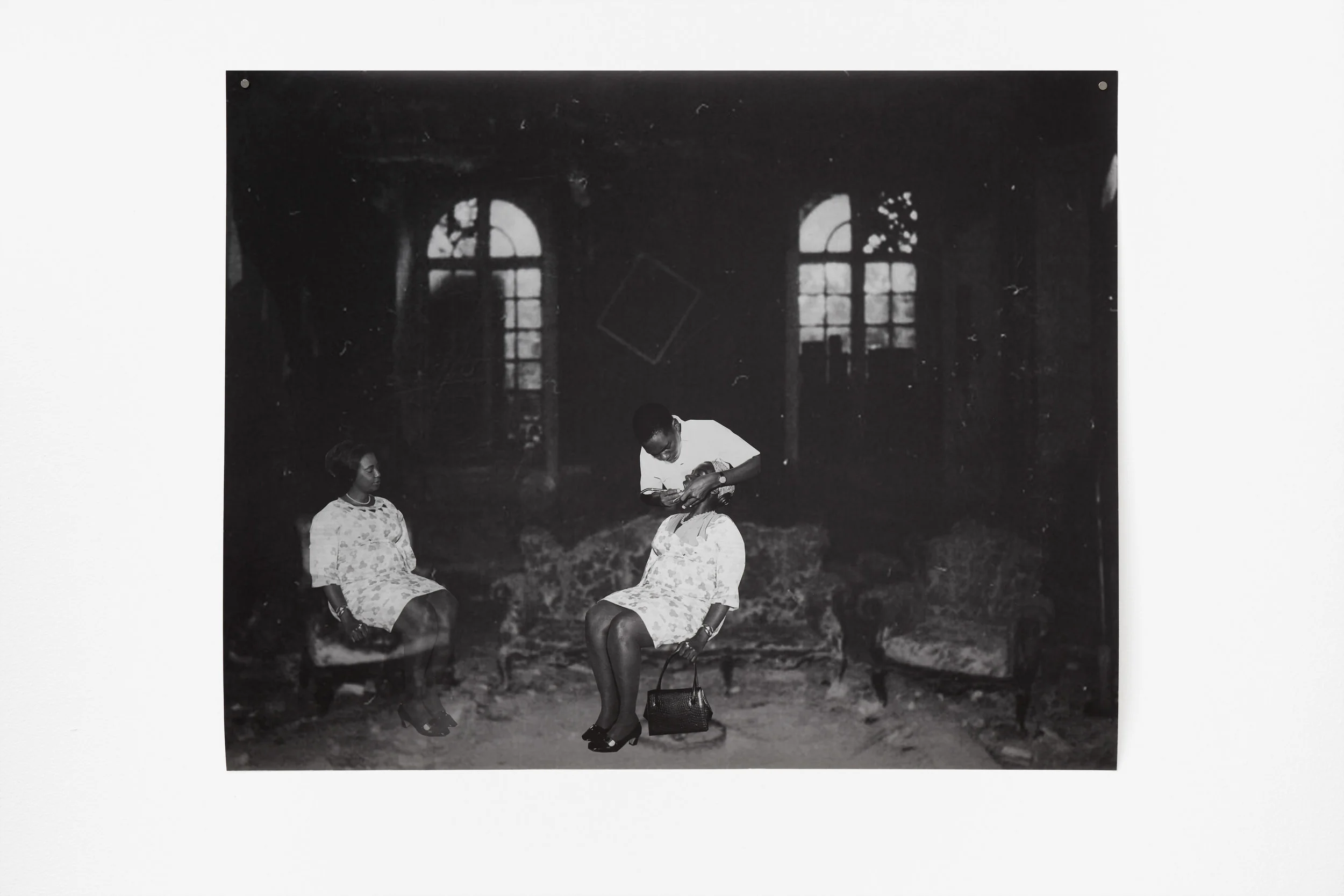
Frida Orupabo, Untitled, 2018, digital C-print, 89 x 105 cm, Courtesy of Galerie Nordenhake and the artist.
I don’t care for Instagram so I was relatively late to discover the work of @nemiepeba. I had no idea Frida was Norwegian, and that she lives about 300 metres away from me in Oslo. She is half Nigerian, like myself. I was stunned. Not because another Norwegian-Nigerian woman with a cultural agenda lived nearby, but because one of this country’s most significant contributors to Blackness in visual culture had been right under my nose for some time. I had never heard anyone talk about Frida, never seen her work included in a show nor seen her at an opening. It seemed that Frida’s almost unbelievable path to international fame had gone unnoticed to most in the Oslo art scene; Arthur Jafa’s crucial advocacy for Blackness, and use of Instagram, was in other words decisive for her breakthrough.
The role that a digital platform has played in disseminating Frida’s work (and her discovery) can be argued to be a democratisation of hierarchies in the art world, but it seems less relevant to me as @nemiepeba had little effect on the local audience, even more so because I first saw Frida’s work as enlarged collages; collage being the only thing I am certain about in the search for an expression for Blackness in Norway. Formally emerging from the philosophy of Dada artists and their distrust of rationalism and the order of civilisation, collage seems naturally suited to re-build social structures, comment on racial hierarchies, politics and culture, and display the complexity and nuances of a dispersed identity.
Frida’s digital collage of two black women and a black male dentist in a manor house combines WTO vintage photographs from Uganda (c.1970s) with Nona Limmen’s “Photogenic 18th century mansion captured on Polaroid”. For years, Frida has created an archive of images found online and used it as the basis for her digital and physical collages. She is interested in how we see things: race, sexuality, gender, family relations and motherhood, and by combining images that are not meant to be together, she challenges how we understand and talk about the arrangement of things. In Untitled it is unclear which bodies and actions belong where and when. Do black bodies (not) belong in (abandoned) mansions? Does the work of a black dentist belong there? The women are similarly dressed with identical shoes and bracelets and their dresses have the same pattern. How many times have I not been mistaken for someone with the same skin colour as myself?
The art of Frida Orupabo, both on and off Instagram, is of tremendous importance in promulgating Blackness in Norway. The lack of visible focus on the topic makes it seem like no one is working on it, making it harder to locate each other and start the discourse that will help build an identity around being brown or black in Norway today. Luckily, the Norwegian art institutions have now noticed her, and she is opening her first solo exhibition in Norway at Kunstnerens Hus on 1 March 2019.
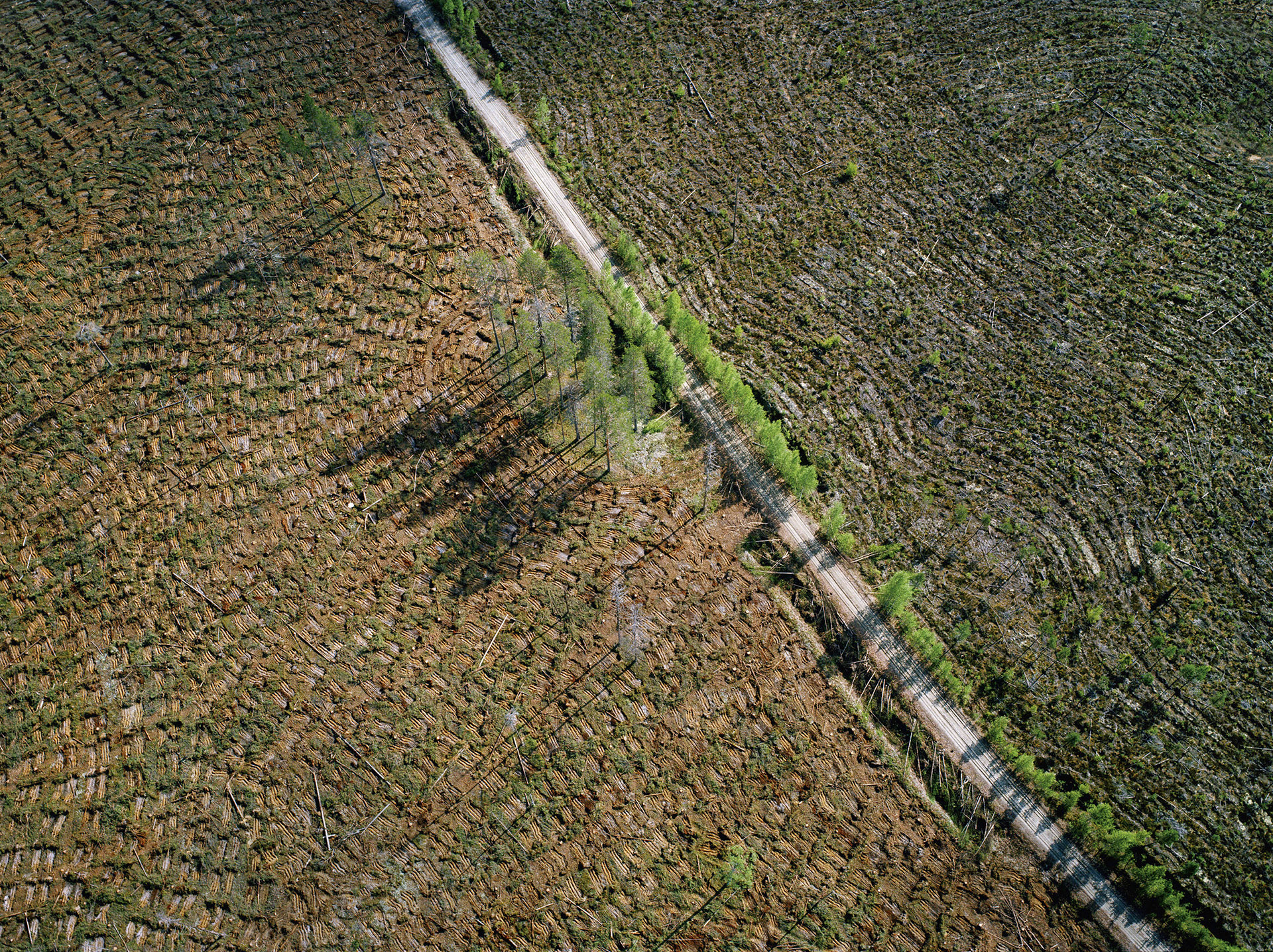
PATRIK RASTENBERGER

Patrik Rastenberger, from the series Küme Mogñen – a healthy mind in a healthy land, 2018
Afterimage by Anna-Kaisa Rastenberger:
Two photos of destruction occupy my mind. They show no corpses, blood, gestures of desperation, or homes in ruins. Instead, the destruction takes the visual form of a landscape, with the reference imprinted in a surface pattern or abstraction across time. This photographic method could be even termed ‘aftermath photography’: the photos abstract from the traumatic historical events taken as subject matter. In both cases, the photographer has arrived on the site years or decades after the conflict.
Ritva Kovalainen & Sanni Seppo, Sateenkaarenpää (The end of the rainbow), 2007/2019
In the photo by Patrik Rastenberger eucalyptus trees are planted where a natural forest once stood. Eucalyptus forests grow rapidly, and the wood is ready for harvest every 10–15 years. That makes them attractive in places such as Chile, where this photo was taken. Here, eucalyptus is an invasive species supplanting natural forests. The leaves that fall from eucalyptus trees are acidic, killing the species-rich undergrowth as they decompose. Also, they need vast amounts of water, so the area grows drier and habitats change. Such overexploitation of resources and cultivation of nonnative species at the expense of variety are among the greatest factors in erosion of biodiversity. Biodiversity involves genetic development of the species tapestry over time, into rich and resilient ecosystems, and it is often measured in the species count: 1 in this photo.
The second image was captured by photographers Sanni Seppo and Ritva Kovalainen, long-time forest activists in Finland: Photography is their main weapon against state forest policies that entail a shift from natural forests’ diversity to managed ‘fields of wood’. Their long-term projects have investigated clearcutting of natural forests and its effects at ecosystem level, in how both biodiversity and human lives suffer. Such images portray another face of climate change and habitat destruction/fragmentation: we zoom out to sterile manmade lines, stark patterns in biodiversity’s decline.
Both photos represent forests, but they do far more when read in the context of reduction of biodiversity. They are two ways of answering the question I pose of how to visualise lost diversity and richness, now replaced with a diversity-poor monotone. How can we show the absence of thousands upon thousands of species, which once inhabited these forests and composed a rich ecosystem? The invisible massacre in our environment.
The battle over knowledge and its control and distribution has become a defining development of our time. However, the question about photography is an old one: how photos visualise something that cannot be seen and, further, how we read in them something that is absent.
STEIN RØNNING

Stein Rønning, ROUTHE II, 2014. Lightjet on paper, 86 x 63 cm. Courtesy the artist and Galleri Riis.
Afterimage by Kåre Bulie:
Why am I so enthusiastic about Stein Rønning’s photographs of boxes that I just never forget them? Since 2008, I’ve followed, with a growing fascination, the development of these images moving from one exhibition to another – in Arendal, in Oslo, in Kristiansand, and once again in the Norwegian capital. I’ve also written about them on several occasions. When Objektiv asked me to contribute to the "On my mind”-column, Rønning’s “object photographs”, which the artist himself has called them, were the first pictures that came to my mind, even if it’s been a while since I’ve seen them outside of the internet.
For those who don’t know them, these works might seem dry, almost evasive in their ascetic elegance. For whoever gives them time and attention, there is much to discover and reflect further upon.
The creation process is complicated: The artist, originally known as a sculptor, and who still exhibits physical sculptures in addition to the photographs, first makes the boxes. He then places them together in continually changing combinations and photographs them. The photographs Rønning presents are also processed digitally – the same box can, for example, be seen in several places in one and the same photograph. Under changing titles, throughout more than a decade, the artist has worked with what is fundamentally the same project. There is nonetheless variation: in colouring, scale, composition, and the creation of space. Some of the photographs give associations to painting and consequently open for reflections on a third medium.
I think my enthusiasm for these images has to do with how they bring together so much of what interests and excites me. First of all, there is something arch-modernistic about the universe of forms in Rønning’s works, which mobilizes my fascination for the entire history of modernism. Secondly, the box project is an example of an art that is exciting to look at and interesting to think about at the same time – visually striking and intellectually stimulating in equal measures. This is not at all an obvious combination in this day and age. Third of all, these motifs have something markedly architectonic about them, which agrees especially well with someone who has always had parallel interests in visual art and architecture. The Rønning photographs steer the thoughts both to the adults’ Manhattan and to children’s building blocks. Like many of his modernist colleagues, in his art, Stein Rønning points at the potentially great significance of the small difference – and at the richness that reduction and concentration can lead to.
ROBERT HEINECKEN

From Robert Heinecken's series Are You Rea (1964-68)
Afterimage by Matthew Rana:
Seduction belongs to artifice. It's a play of surfaces and transformation, disappearance and gestural veils. In other words, seduction is fleeting and mysterious, it takes what's visible and licks it with falsity. On a different register, pornography might be pure allegory: forced over-signification verging on the baroque. With its graphic disclosures, pornography points to an external logic, an invisible power that determines what can be seen. More simply put, it leaves nothing to the imagination.
Unlike his more libidinally charged works that actually make use of pornographic imagery, Robert Heinecken's series Are You Rea (1964-68) seems to negotiate the tension between these two poles. In the 25 photograms, magazine pages featuring advertisements for products such as cosmetics, cigarettes, lingerie and spaghetti, are juxtaposed with images of police violence, protests and photo essays on reproductive rights. Layering image on top of image, recto and verso are flattened, so to speak, onto a single surface. The compositions are chancy and ironic; everything is inverted and continuity and scale are confused Often full of sex appeal, the images in Are You Rea also indicate a loss of coherence, a figuration that is ghostly and at times grotesque. But despite all their violence, fragmentation and internal dissonance, they seem less about critique or defamiliarization than they do correspondences. Because if archives create the illusion of totality by making gestures of equivalence between things archived (i.e., between an ordered multiplicity of things, indexed and gathered together to be read as a single entity), Heinecken's series is archival in that it suggests a deep and dark unity.
I think this might be part of why his work still looks so fresh to me, especially the photograms. It's their insistence on materiality and distribution. What I find across the multiple surfaces, in the patterned utterances and the vulgar repetitions, is not the reality that's hidden behind appearances. Rather, it's the spatialization of circulatory and temporal relationships, of reading and discourse. If speech takes place at the intersection of material and social forces, then this is how the archive surfaces – a shifting assemblage of contradictory and inconclusive statements – iterative, synthetic, hardcore.
SUSANNE M. WINTERLING

Afterimage by Susanne M. Winterling:
Shadows and forms seem to reach out of the frame and pass right through the installation space. A hand approaches or withdraws from a chest blemished by marks. The fragility of this skin that has just been touched or is about to be touched contrasts with the image itself, which manages to convey the opposite of fragility. The black and white photograph comes from another time and yet is so necessary in our time.The photo was shown in the exhibition Black Beauty, which included an installation in which tons of black coal slag filled the entire gallery floor, and the site-specific work Black Magic, made from vibrating black astroturf cladding the walls. The glimmering sand-like coal seemed to point to the photograph, which was placed next to the viewer’s path of the architecture. The resulting dynamic was both of lightness and heaviness, as the exhausting playfulness and desolation of the sand found a correlation in the awkward intimacy of the photograph.This ambivalence is perhaps why this photo in particular has remained with me – its violent affirmation of a skin too thin. Like a spark, the image illuminates a certain and defined materialism within the virtual flow of information and image technology. Without concrete stability, it nevertheless affirms a dynamic and thus a reality, but one that will always remain vague, even though so visceral.
HARRISON SCHMITT
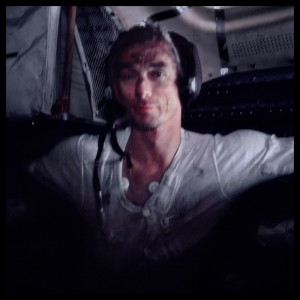
Commander Eugene Cernan After Three Days of Lunar Exploration. Photographed by Harrison Schmitt, Apollo 17, December 7-19, 1972, Michael Light, Full Moon. Transparency NASA © 1999 Michael Light
Afterimage by Laara Matsen:
Taken by fellow astronaut Jack Schmitt as a sort of snapshot, and part of NASA’s extensive and wonderful archive of space imagery, this photograph is of Gene Cernan, Commander of Apollo 17, the last man to walk on the moon. I came upon it years ago, hanging on the wall at the Museum of Natural History in New York, and it resonates with me still. A man at work, covered in moon dust, exhausted and seemingly content, the image speaks to me of the quieter side of grand adventure. Exploration of the unknown is a romantic and exciting notion by nature, and one that led me to photography (among other endeavors) in the first place, but I am especially taken and moved by the less romantic aspects of exploration: the grit of the moon dust. This is a photograph taken after a significant event has occurred, post-climactic. I am often compelled by images of such after-moments, the almost forgotten underbelly of the “main attraction”. While the factual situation documented is anything but common (gunpowder-scented moon dirt clinging to skin, walking in space, probing into mysterious and dangerous territory), there is also something immensely accessible and intimate in this photograph. The simplicity of the moment is at once direct, calm, mundane and ephemeral.