TOVA MOZARD
Afterimage by Max Barel:
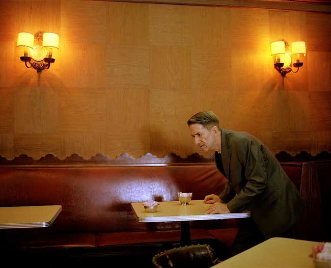
Tova Mozart, Musso & Frank Grill, 2003
I quickly tire of images with a clear framework. Maybe it’s because I want to add my own story to the image—or at least leave room for that. I want there to be a form of communication between the image and the viewer, where my own experiences and associations also have space.
It was interesting to walk around the Grand Palais during Paris Photo. Perhaps mostly because I realised how much I’m unable to be captivated by. As if there’s so much I don’t understand or can’t quite connect with. And where does one’s gaze even come from? Is there a distinct Nordic style, with its own ideas of what works or doesn’t? It was a valuable exercise in trying to look beyond the image itself, beyond the initial response.
I first saw this image a couple of years ago, as a student at HDK-Valand in Gothenburg. At first, it was his hands that caught my attention. Piano fingers, the half-closed gesture, and how they rest on the tabletop—both tense and relaxed. There’s something fragile about them. Then there’s his face. I’m drawn to it, both positively and negatively. I feel a lack of trust in him, almost disgust. His ambiguous gaze and body position—he’s both about to stand up and sit down—create a tension. There’s both calm and noise in the image, a look that’s both distant and determined.
He’s in a transitional phase, caught in an unnatural movement. I think of all the movements we see around us that we don’t have time to notice. In this way, photography is unique: it captures a brief glimpse of something that would normally be out of reach. Many photographers work with similar stagings, and I think a common denominator for the images I enjoy is that they simultaneously depict something staged and something real—a moment captured.
I also keep returning to the themes of playfulness and simplicity. How the cornice at the top of the image isn’t straight, and how I often strive to create straight lines and controlled compositions in my own work. Yet many good images have a crookedness, an imperfection to them. At least in an image like this, with so few elements. An empty restaurant, a few tables, a leather sofa, two lamps, a paneled wall. A pleasant room to be in, yet you can’t avoid the violence he radiates.
Afterimage is an ekphrastic series about that one image you see when you close your eyes, the one still lingering in your mind. We invite artists and writers to reflect on an image they can't shake. This column has been a part of Objektiv since our very first issue, originally titled Sinnbilde in Norwegian. As the sea of images continues to swell, the series explores which visuals linger and take root in today's endless stream - much like a song that plays on repeat in your head. Whether it's an image glimpsed on a billboard, a portrait in a newspaper, a family photo from an album or an Instagram reel, we're interested in those fleeting moments that stay with you and refuse to let go.
